
4-Inch vs 7-Inch vs 10-Inch KNX Touch Panels
Choose a 4-inch, 7-inch, or 10-inch KNX touch panel using screen-area calculations, room-use comparisons, mounting checks, and a practical UI mock-up test.
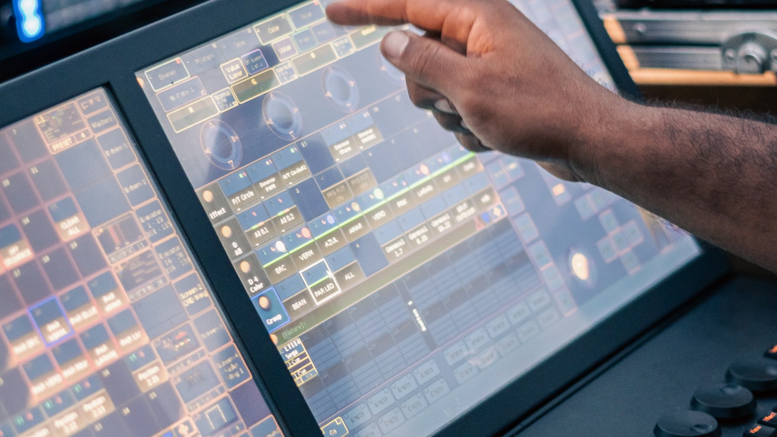
For a bedside scene controller, a compact panel can be the better choice. For a room that combines lights, shades, temperature, and a few status values, a 7-inch panel is a sensible starting point. A 10-inch panel earns its space when people actually need an overview, a floor plan, or several controls visible together.
Those are design starting points, not a product ranking. A larger screen with crowded pages can be harder to use than a small one with four well-chosen buttons. Before comparing prices, list the actions a person should complete without thinking about the interface.
A diagonal is not the usable control area
Screen sizes describe the diagonal. At the same aspect ratio, area grows with the square of that diagonal. A 7-inch screen has roughly three times the area of a 4-inch screen—not just 75% more.
The table below uses hypothetical 16:9 active displays to show the geometry. It excludes bezels and mounting hardware and does not describe any particular KNX product.
| Nominal diagonal | Approximate active width | Approximate active height | Active area relative to 4-inch |
|---|---|---|---|
| 4 inches | 88.6 mm | 49.8 mm | 1.00× |
| 7 inches | 155.0 mm | 87.2 mm | 3.06× |
| 10 inches | 221.4 mm | 124.5 mm | 6.25× |
Calculation: width = diagonal × 25.4 × 16 / √337; height uses 9 in place of 16. Round only after calculating if you are producing a physical mock-up.
Real products differ. Zennio’s Z100 specification lists a 10-inch, 1280 × 800 display—a 16:10 pixel ratio, not the illustrative 16:9 format above. Its older InZennio Z41 documentation describes a 4.1-inch display with a 3:4 format. Check the selected product’s active dimensions, orientation, and overall enclosure drawing instead of scaling a catalogue photograph.
Choose by the home screen’s job
| Size class | A reasonable role | Keep immediately visible | Warning sign |
|---|---|---|---|
| Around 4 inches | Local room or bedside control | A few frequent scenes and simple comfort adjustment | Users must scroll to turn off the lights |
| Around 7 inches | Main room control, apartment entrance, meeting room | Room functions with clear status and navigation | Every available integration is added to the first page |
| Around 10 inches | Shared overview, larger residence, reception/support station | Zones, alarms, or a legible floor-plan view | The screen is chosen only because the wall has space |
An entrance panel and a bedside panel are different tools even in the same room. At the entrance, a guest may want a welcome scene and temperature. In bed, they want lights off without a bright menu opening in their face. One oversized all-purpose page rarely resolves both situations well.
Write a short task list before selecting the size: recall a scene, dim one light, stop a curtain, change temperature, and understand whether a command succeeded. If a function is used once a month, it probably does not deserve the same visual weight as the room’s main light.
More pixels do not automatically make better controls
Resolution determines how much detail can be drawn. Physical size determines how large that detail appears. The UI software decides whether it uses the extra pixels for sharper text, more controls, or both.
As an arithmetic example, an 80-pixel-wide button on a hypothetical 7-inch, 1280-pixel-wide 16:9 screen is about 9.7 mm wide. On a 10-inch screen with the same ratio and horizontal resolution, it is about 13.8 mm. These are calculated dimensions, not recommended minimum touch-target standards.
A specification that only says “80-pixel buttons” misses that difference. Review the rendered page at actual size. Include text labels, spacing, gloves if the use case requires them, and people who are unfamiliar with the building. For projects with accessibility obligations, have the responsible designer verify the applicable requirements rather than treating a generic screen-size table as compliance evidence.
Watch the vertical layout too. A portrait display can suit a compact list of room controls, while a landscape display may suit a floor plan. Neither orientation guarantees fewer taps. Follow the navigation path for each everyday task.
Inspect the wall before choosing the screen
The installation drawing often removes more candidates than the feature list does.
| Physical check | What to verify on site |
|---|---|
| Back box | Exact compatible type, depth, fixing points, and cable-entry space |
| Wall finish | Finished thickness, flatness, trim overlap, and service removal |
| Power | KNX-only, auxiliary DC, or supported PoE arrangement; required supply budget |
| Data connection | Whether Ethernet is needed for core functions or only optional features |
| Viewing conditions | Daylight glare, approach angle, reflections, and nighttime brightness |
| Temperature sensing | Manufacturer guidance on sensor location and compensation |
| Maintenance | Access to reset/service controls without damaging the finish |
A display mounted over a warm supply or in direct sun may be a poor place to measure room temperature. Do not use an integrated sensor by default simply because it appears on the product sheet. Compare it with the HVAC control strategy and the manufacturer’s installation requirements.
Likewise, do not assume a 10-inch unit can replace a 7-inch unit in the same opening. Even models in the same family can need different boxes, power arrangements, and clearances. Agree those details before the wall finish is ordered.
Test feedback, not only attractive graphics
Pressing a light icon should not be the only reason that icon changes color. Decide whether the display shows the last command, actuator status, or measured load state. Those meanings differ when somebody uses a manual override or when communication fails.
For each important function, define the feedback object and what the panel displays when the information is unavailable. A frozen “ON” symbol should not look like a confirmed live state indefinitely. This is as important on a small panel as on a large one.
Also separate local room control from optional remote services. Ask what still works when the internet connection, LAN, visualization server, or panel itself fails. These are four different tests. Useful background is covered in KNX touch panel UI design and the touch panel buying guide.
Run a short mock-up before approving quantities
Print the active screen and enclosure outline at full scale. Position it at the proposed location, then test the actual device or an accurate interactive mock-up. A page on a laptop screen is not an adequate substitute for final size and viewing angle.
Ask an unfamiliar user to perform the agreed task list without instruction. Record missed touches, accidental navigation, unreadable labels, and unclear feedback. Repeat in the evening with the room darkened. Include a curtain stop action: it reveals whether a person can quickly reach an important control while something is moving.
Then check the longest translated labels and the busiest legitimate page. Do not approve only an English demonstration screen with three icons if the final installation needs another language and a dozen functions.
Compare installed cost, not just panel price
The comparison should include the panel, box, supply, network connection, software options, UI configuration, testing, and replacement strategy. A large panel can reduce the need for a separate overview display, but it does not eliminate local controls unless the design deliberately makes that tradeoff.
For a hotel, maintaining consistent guest behavior across room types may be worth more than maximizing display size. For an owner’s residence, the value may be a readable whole-house overview. Decide which problem the extra area solves, then price it.
Is a 10-inch panel faster than a 4-inch panel?
Not because of its size. Processor, software, rendering, network paths, and control architecture affect response. Test the actual models and intended pages.
Can a 4-inch panel operate a whole home?
It may expose the functions, but the navigation can become cumbersome. Keep the most frequent actions local and consider a separate overview interface where needed.
Should all rooms use the same panel?
Consistent interaction is valuable; identical hardware is optional. Match each location to its tasks while keeping naming, icons, and feedback behavior consistent. Bring the task list and wall constraints to a selection discussion, not only the desired diagonal.